Case Study · Mobile Banking · Fintech · UAE

Raqam Bank —
Digital Banking,
the Human Touch

Reimagining mobile banking for UAE's expat majority — transparent international transfers, AI-powered spending insights, and an enterprise operations dashboard.
Role
Lead Product Designer
Platform
iOS · Android · Web
Timeline
14 months
Market
UAE · MENA
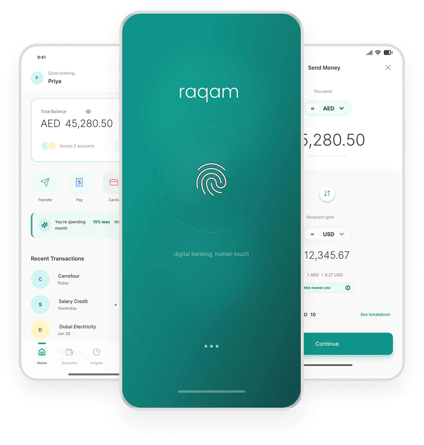
Raqam Bank app screens
+20%Transfer completion rate
−30%Time to complete a transfer
40%+AI insights engagement
88%Expat population served
01 — Challenge

Banking for a nation of expats

UAE's 88% expat population sends billions overseas monthly, yet existing banking apps treated international transfers as an afterthought — hidden fees, opaque rates, and multi-step flows that eroded trust at every touchpoint.

Raqam Bank needed a mobile-first product that would feel human, transparent, and genuinely built for people whose primary financial concern is keeping money moving across borders.

02 — Research

Understanding the transfer anxiety loop

We ran 24 contextual interviews with expats across salary brackets — from construction workers sending AED 500 monthly to finance professionals moving AED 50,000+. Three core pain points emerged:

1. Fee opacity: Users couldn't tell the true cost until the last screen. 2. Trust deficit: No clear audit trail once money left the app. 3. Insight blindspot: No spending awareness, leading to "month-end panic."

03 — Competitor Analysis

What the market got right — and left open

Audited 4 banking products used by UAE expats. Every competitor addressed part of the problem — none addressed all of it.

Retail-focused UAE Banking
RAKBank
What works
Clean, user-friendly interface consistently praised in app reviews
Smooth core banking — balance checks, transfers, bill payments without friction
AI-powered transformation — reduced compliance processing and AI assistant in-app
Gaps found
Card management is weak — users can't see or manage multiple debit cards or set priority
No meaningful spending insights or financial wellness tools
Limited features compared to larger UAE banks
Full-Service Banking
ADCB
What works
Good expense categorization
Comprehensive features
Gaps found
Overwhelming UI
Poor information hierarchy
Global Fintech
Wise / Revolut
What works
Best-in-class transfer UX
Transparent pricing
Gaps found
Not UAE-banking integrated
Limited local features
UAE's Largest Full-Service Bank
FAB
What works
Consistently ranked safest bank in UAE and Middle East by Global Finance
2026 app refresh — faster login, better biometrics, Quick Actions dashboard
Strong institutional trust and widest product range in market
Gaps found
Charges lack transparency — unexplained deductions with no breakdown in-app
Supplementary cards not visible in the app — a basic feature gap frustrating users
Weak spending intelligence and no proactive financial insights
Raqam's opportunity
No product combined transparent pricing (Wise's strength), UAE banking integration, and proactive spending intelligence in one experience. Raqam's brief was to close all three gaps simultaneously.
04 — Persona

Designing for Omar — the mobile-first expat

Composite persona built from 24 contextual interviews. Represents UAE's largest banking segment — salary-earning expats aged 28–42 sending regular remittances home.

OA
Omar Al-Rashidi
Finance Analyst · 34 · Dubai, UAE
Mumbai → Dubai · 6 years in UAE · Sends AED 3,000–8,000/month home
"I don't trust an app that shows me the fee only at the last step. I've lost money that way."
Goals
Send money home without surprises
See exact total cost before confirming
Track spending without extra apps
Frustrations
Hidden FX margin revealed at confirmation
No receipt or audit trail after transfer
App crashes mid-flow on 4G networks
Behaviours
Checks 3 apps before choosing to send
Screenshots confirmation screens manually
WhatsApps family to confirm money arrived
05 — Journey Map

From transfer anxiety to earned trust

End-to-end map of an international transfer — revealing the 30% drop-off at the review screen caused by fee disclosure coming too late in the flow.

Trigger
App Open
Rate Check
Fill Details
Review
Post-Send
Action
Salary credited — decides to send monthly remittance
Opens Raqam, taps "Send Money"
Sees live FX rate + 0.3% fee on screen 1
Enters amount, selects saved recipient
Reviews full cost breakdown before confirming
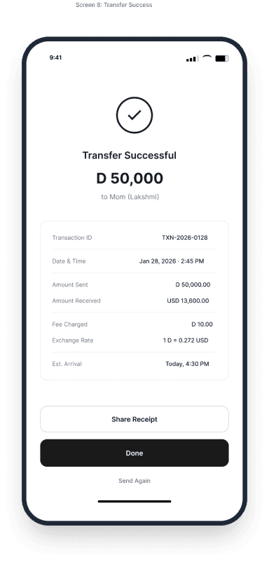
Receives PDF receipt + push notification
Thinking
"Need to send before rates change."
"Let me check what the rate is today."
"Fee is clear upfront — that's fair."
"Auto-fill worked — saved time."
"AED 1,047.50 total — no surprises."
"Done. Sharing the receipt on WhatsApp."
Emotion
Anxious
Cautious
Reassured
Confident
Trusting
Relieved
Opportunity
↑ Rate-change push alert at salary credit moment
↑ One-tap resume for recent transfers
↑ Live rate ticker before user commits
↑ Smart autocomplete for frequent recipients
↑ Full cost shown on screen 1, not confirmation
↑ Auto-share receipt via WhatsApp
06 — Information Architecture

Flat, task-first navigation

The original app buried key features 4 levels deep. We restructured to a 2-level flat hierarchy — every core task is reachable in 2 taps or fewer. Five tab bar sections map directly to user mental models.

Home
Transfer
Insights
Cards
Profile
Dashboard
Quick Send
AI Insight
Recent Activity
Rate Ticker
Send Money
Schedule
Recipients
Rate Alert
History
Monthly Summary
Categories
Weekly Insight
Savings Tips
Export
Virtual Card
Physical Card
Controls
Statements
Freeze
KYC Status
Documents
Security
Notifications
Support
2 levels max
No buried navigation
≤ 2 taps
Core tasks reachable
5 sections
Matches user mental models
RTL ready
Full Arabic support
07 — Wireframes

Low-fidelity flows before pixels

Two critical paths mapped as lo-fi wireframes before any visual design. The 5-step transfer flow and the AI insights surface drove the most iteration — each screen refined through 3+ rounds of user testing.
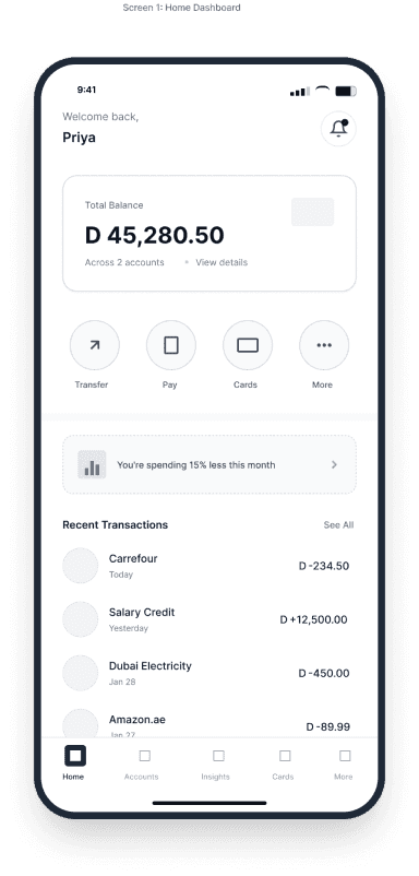
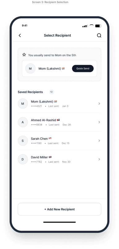
Transfer Flow5 screens · Dashboard → Recipient → Amount → Review → Success
Dashboard
Dashboard
Select Recipient
Select Recipient
Enter Amount
Enter Amount
Review
Review
Success
Success
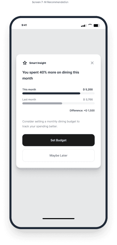
Smart Insights Flow3 screens · Overview → Category → AI Recommendation
Insights Overview
Insights Overview
Category Details
Category Details
AI Recommendation
AI Recommendation
08 — Design System

Financial-grade components, Arabic-aware

We built a 150+ component system supporting both LTR and RTL layouts from day one — not as an afterthought. Every number format, date pattern, and currency display was tested against Central Bank of UAE guidelines.

Colour semantics were redefined for financial context: green only signals success, amber surfaces warnings, red is reserved for errors — never decoration.

09 — Key Flows

Transparent transfers & AI spending insights

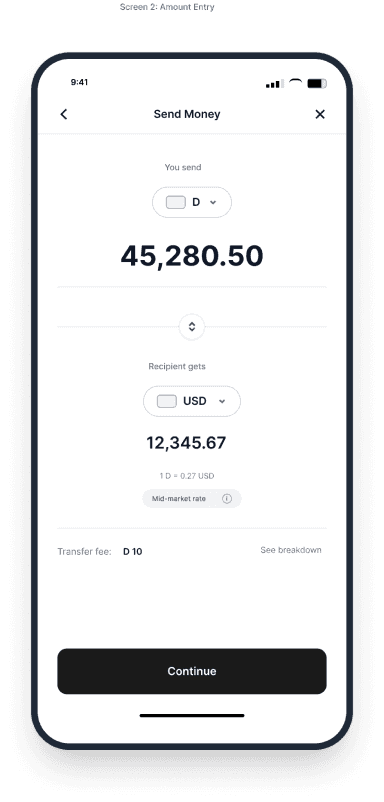
The transfer flow was collapsed from 7 screens to 4, with the total cost (fee + FX margin) visible on the first screen. A live rate ticker gave users confidence without requiring them to switch apps.

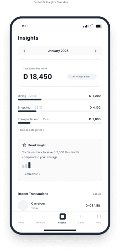
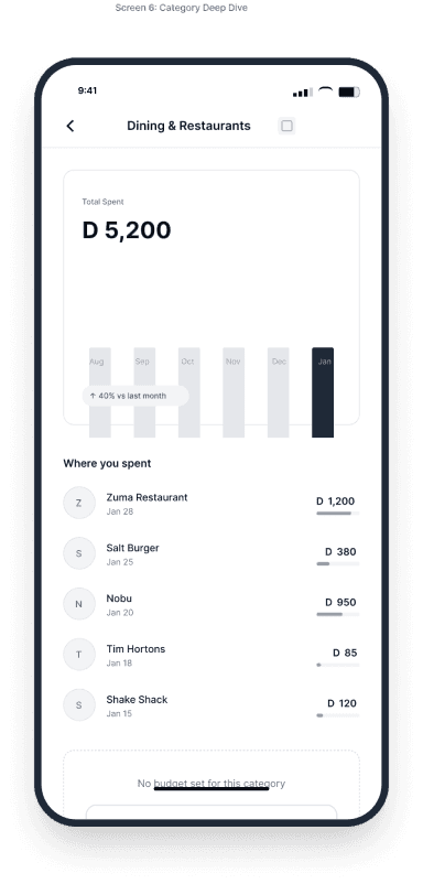
The AI insights module surfaced one actionable observation per week — not a dashboard of charts, but a single sentence like "You spent 40% more on dining this month vs. your 3-month average." Engagement hit 40%+ within 60 days of launch.

10 — Screens
Onboarding & KYC
Identity & Compliance
International Transfer
Transparent FX + Fees
AI Spending Insights
Personalised Intelligence

NDA — hi-fidelity screens available on request

11 — Learnings

What shipped, what we would change

Trust is earned at edge cases
The failure states — network errors, transfer holds, FX rate expiry — were where we won or lost users. We spent 30% of design time on flows most PMs consider secondary.
AI needs a voice, not a dashboard
Early prototypes showed charts. Users ignored them. A single sentence in plain English drove 3x more action than any visualisation.
Arabic-first is not just RTL
Date formats, number grouping, and even the meaning of colours differ. We embedded a native Arabic speaker in every user testing session from sprint 2.
Next steps

Want to see hi-fi screens or the full prototype?