Pet Cloud —
a home for every pet family
End-to-end design of the Pet Cloud customer portal for Oslo Pet Insurance — giving pet owners a personalised, self-service space to manage policies, track their pets, submit claims, and access vet care in one warm, friendly interface.
Pet insurance with no
digital home
Oslo Pet Insurance had a strong product but no self-service portal. After purchasing, customers had no way to view their policy, track claims, or manage multiple pets — every query went to the call centre.
The brief: design a portal that eliminates the call centre as the default support channel, while making pet owners feel genuinely at home.
What pet owners actually
needed
Interviews with 14 existing customers in Dubai and Abu Dhabi. One question drove the research: what do you wish you could do yourself, without calling us?
After submission, customers heard nothing. "I submitted a claim 2 weeks ago and still don't know if it's being processed." Real-time status was the #1 request.
Families with 2–4 pets had different renewal dates, coverage levels, and claim histories — impossible to track without a dedicated view per pet.
Users couldn't answer "what is my pet covered for today?" A coverage status card — not a PDF — was what they needed.
Pet owners see their pets as family. A cold dashboard kills trust. Warmth, personality, and using pet names throughout the interface drove engagement.
- Check claim status on mobile
- Get renewal alerts before expiry
- See coverage summary at a glance
Calls the call centre 3× per claim — no self-service status tracking.
- Multi-pet household at a glance
- Download claim documents
- Separate policy tracking per pet
Each pet has a different expiry date — impossible to track without spreadsheets.
Sketching the whole
home before decorating it
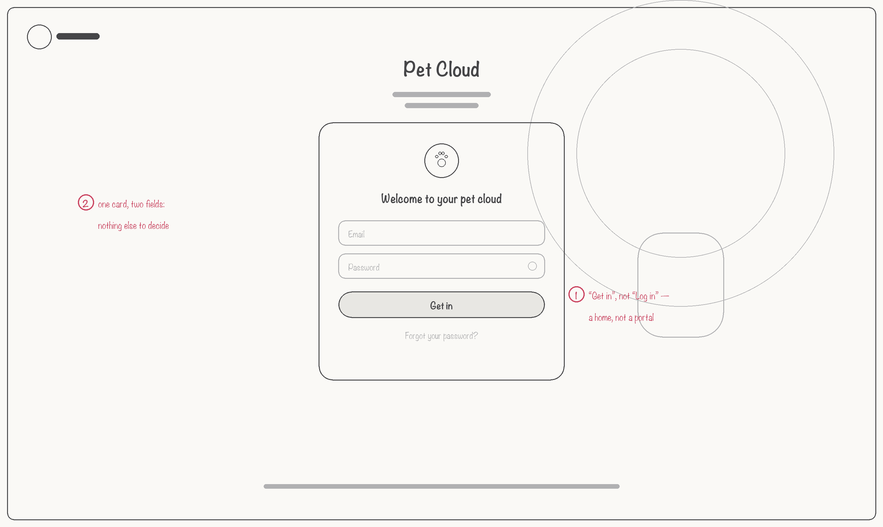
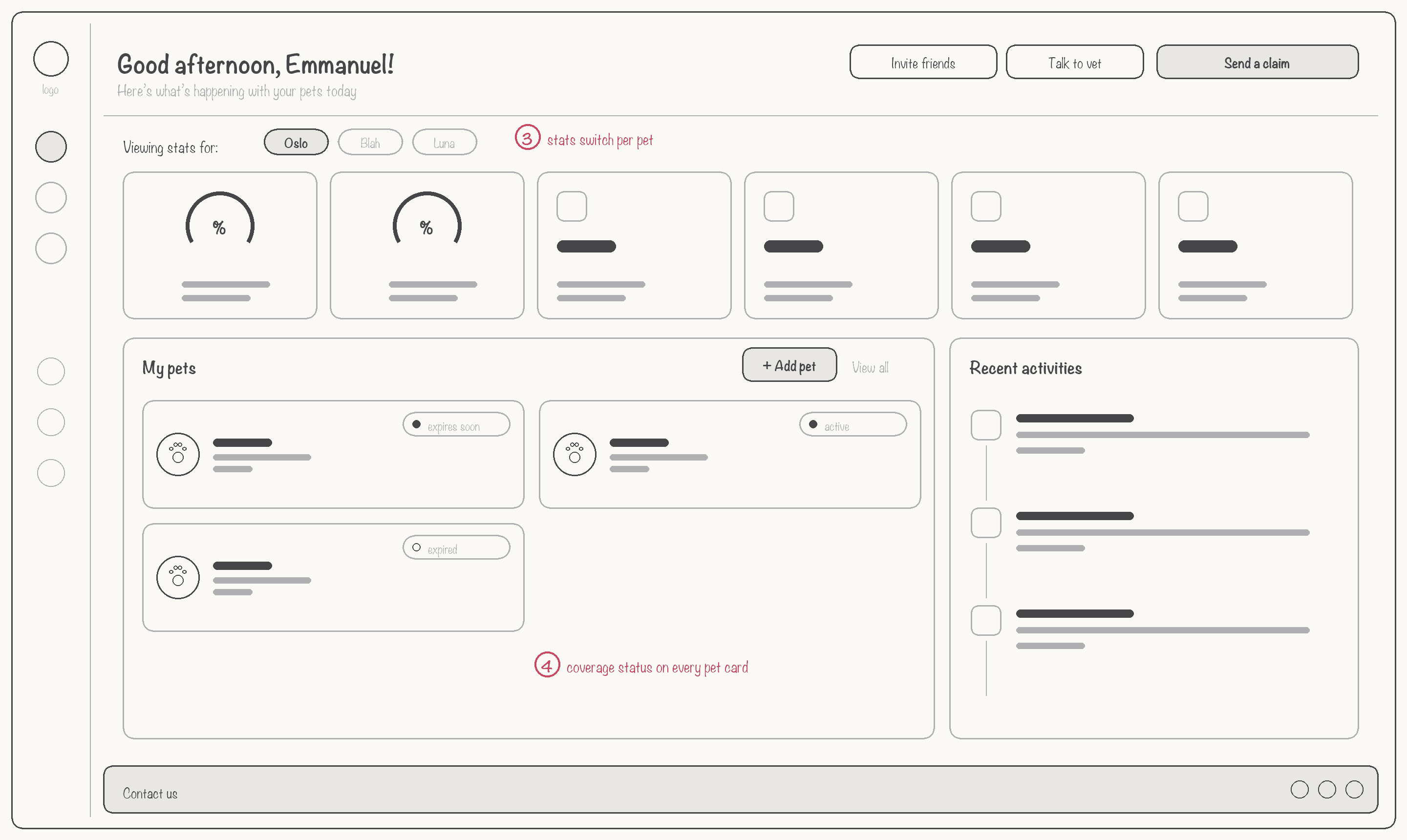
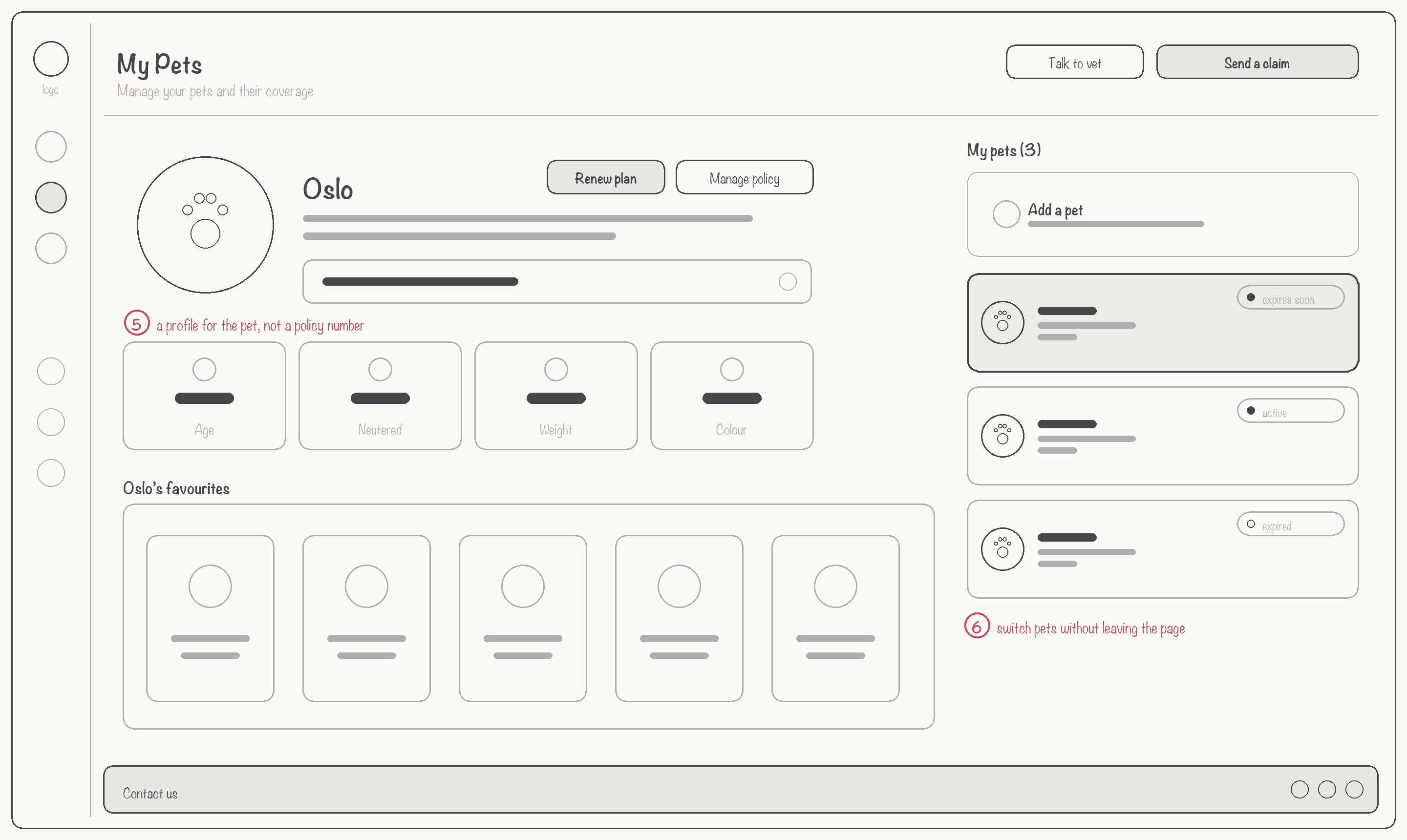
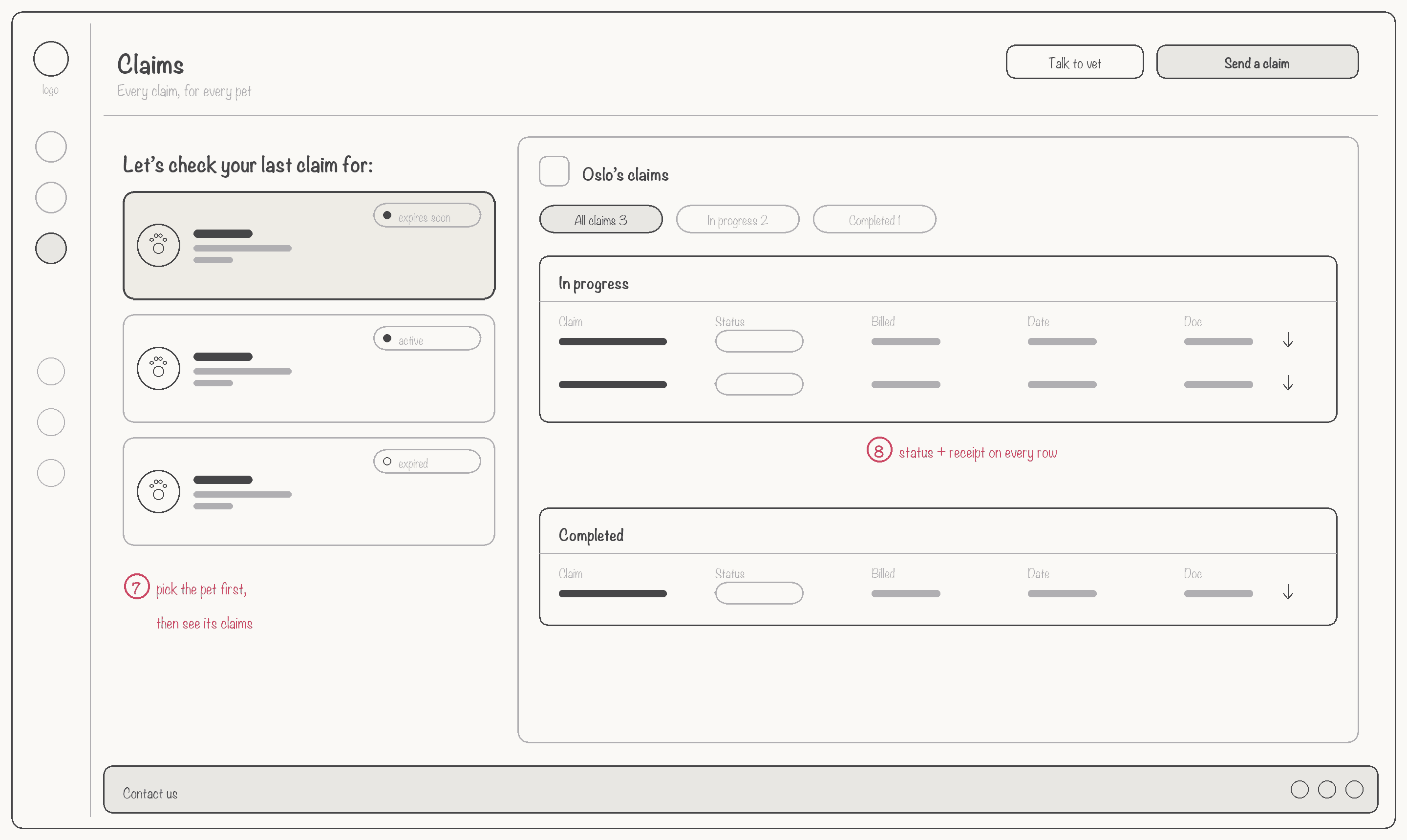
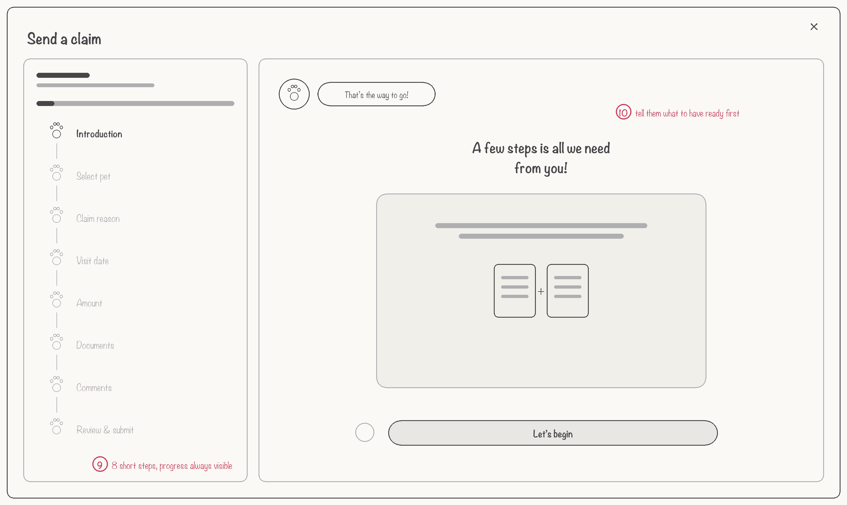
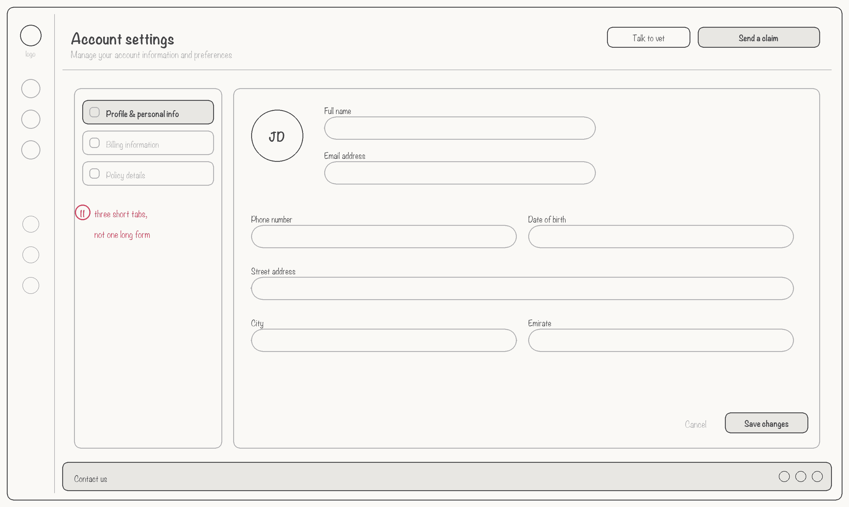
Before any colour or illustration, I wireframed the six core screens to agree the structure with Oslo’s team: a pet-first navigation, coverage status visible everywhere, and claims broken into short steps. The same shell — icon rail, greeting header and a persistent “Send a claim” — carries through every page.
A login that feels like
coming home
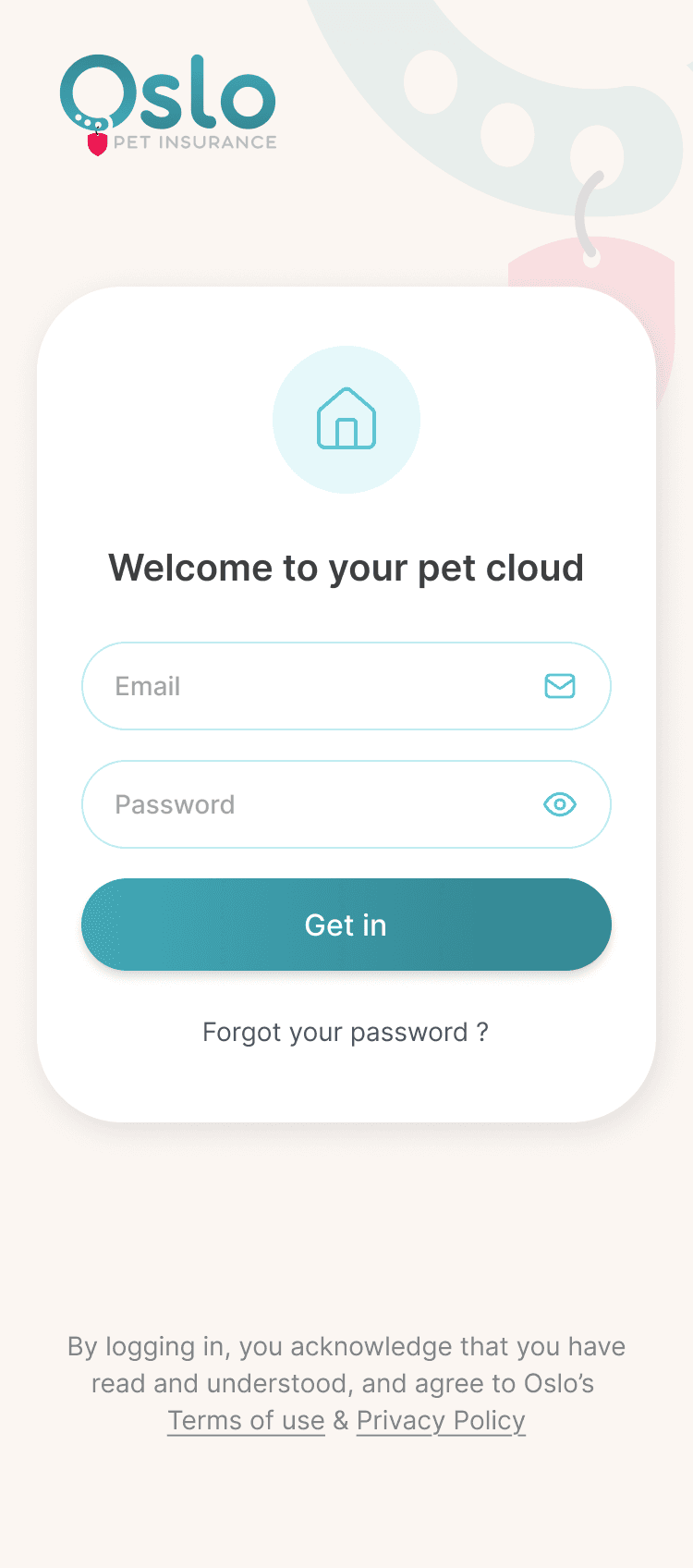
The login screen sets the tone for the entire portal. Warm cream background, a pet collar decorative motif, and copy that says "Welcome to your pet cloud" — not "Sign in to your account."
Everything at a glance —
no drilling required
The dashboard surfaces what customers called most: claim ratio, coverage used, policy status, recent activity, and all their pets — in one view. Quick-action CTAs (Talk to Vet, Send a Claim) live in the header.

Tab switcher shows stats scoped to each pet — Oslo, Blah, Luna — individually.
Real-time events (Claim Submitted, Policy Renewed) replace the call centre update call.
"Send a Claim" and "Talk to Vet" always accessible in the header — zero navigation required.
Every pet has their
own story
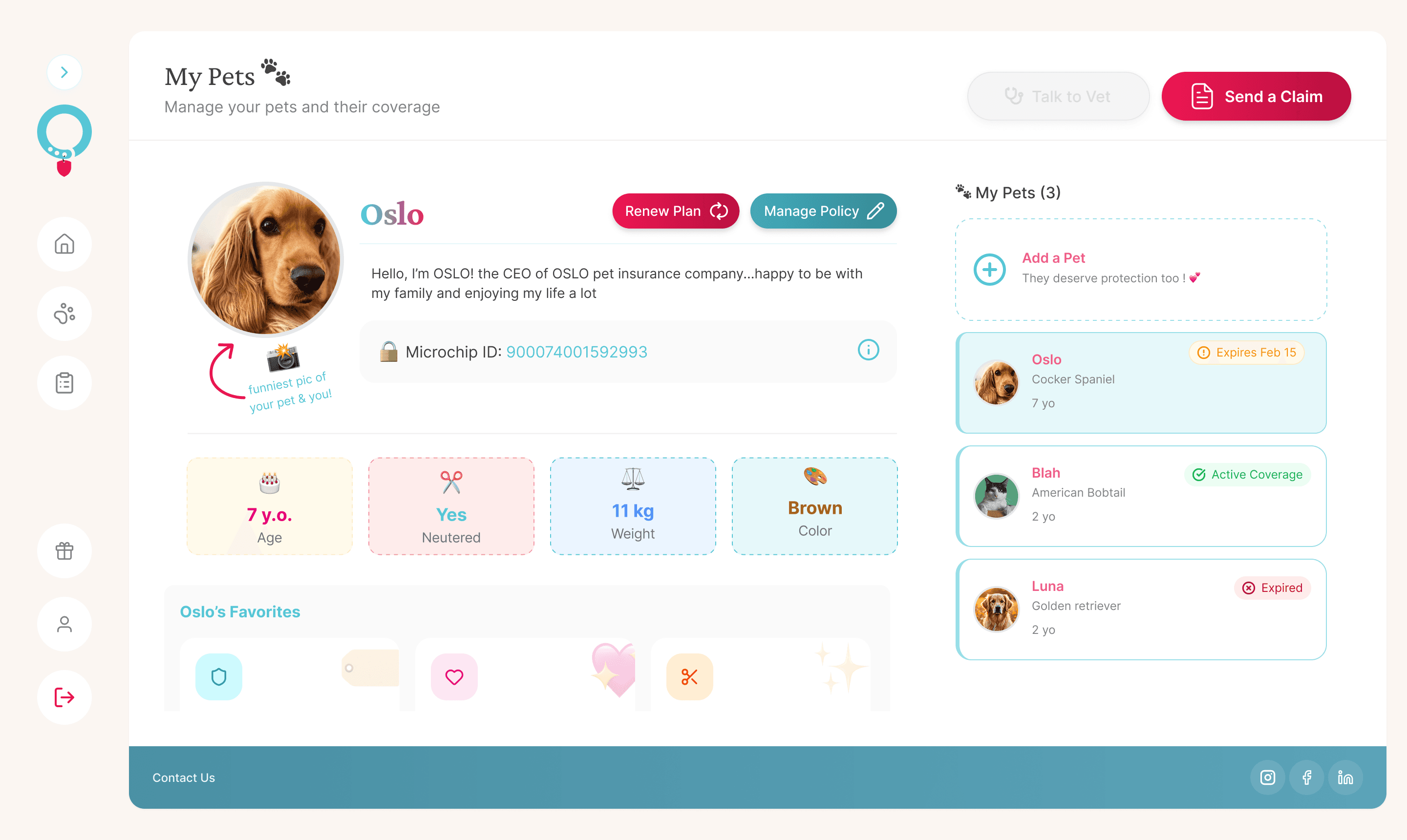
Each pet profile is personalised — photo, bio, microchip ID, and physical stats (age, weight, color, neutered). An "Oslo's Favorites" section gives the interface warmth. Policy actions (Renew, Manage) sit inline with the profile.
Transparent claims,
real-time status
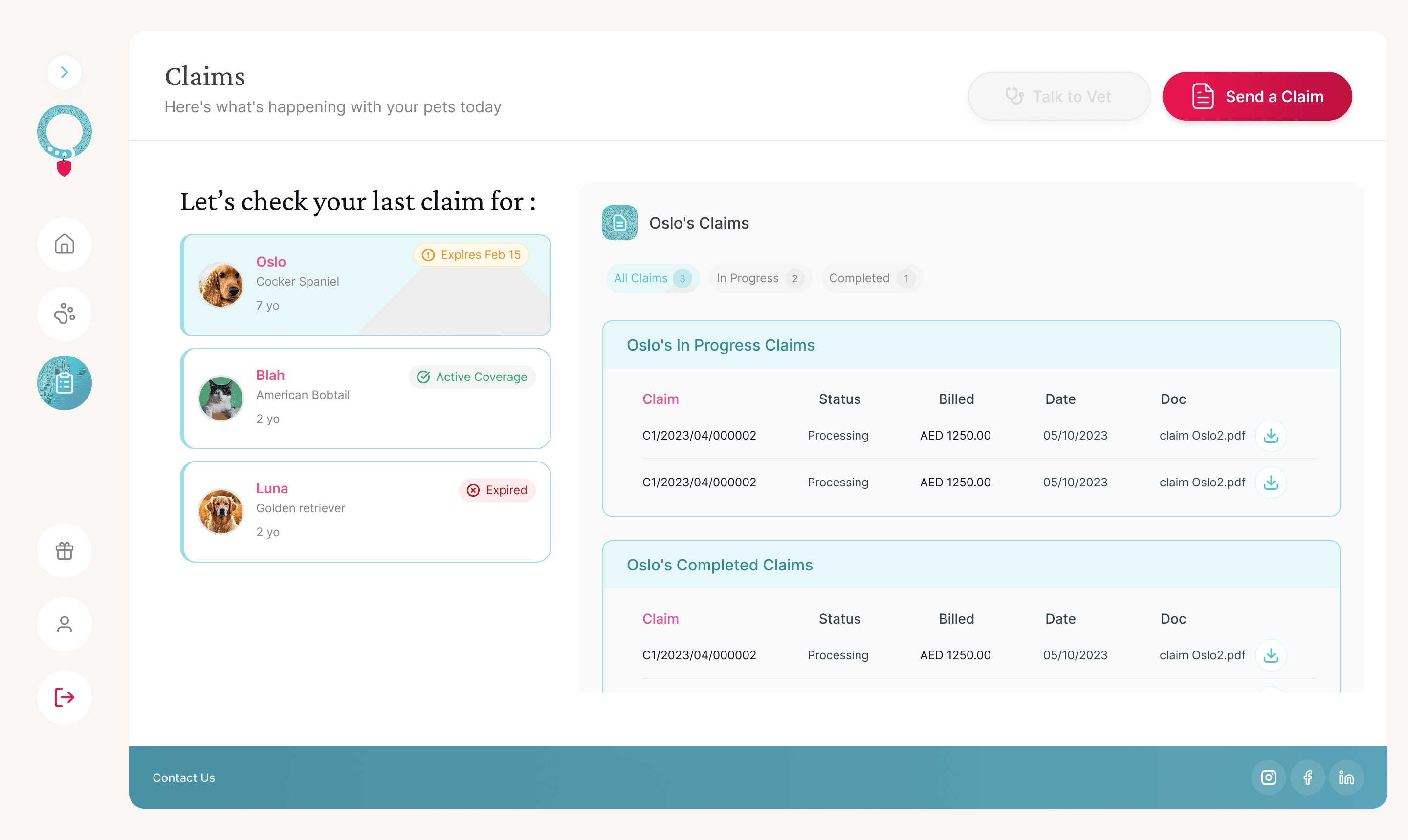
The module that eliminated the #1 call centre driver. A split layout lets users select which pet's claims to view, then browse by status (All / In Progress / Completed) with instant PDF document access.
Designed for
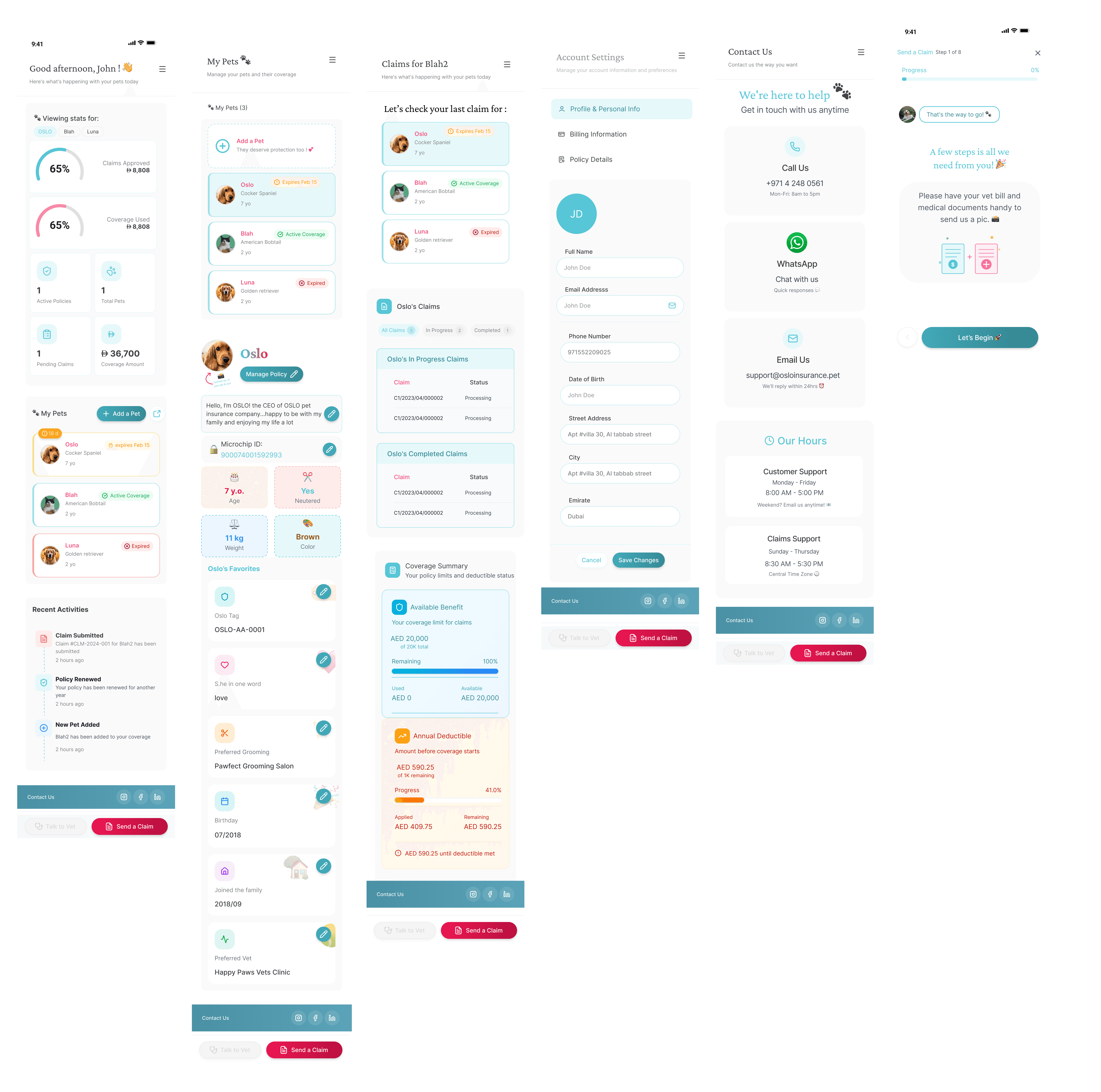
every screen
What this
project taught me
A warm, pet-centric identity — not generic insurance UI — drove genuine engagement. Users described the portal as "friendly" and "not intimidating."
Designing for households with multiple pets at different policy stages required careful information architecture. The pet-as-anchor pattern solved it.
Real-time claim status transparency was the single highest-impact feature. Reducing uncertainty reduced call centre load by removing the reason to call.
Shipped to
production
Pet Cloud is live — a fully responsive web application serving pet owners across the UAE and Norway with self-service policy management, claims tracking, and vet access.
Visit oslopetinsurance.pet ↗Interested in working
together?
I design products people love to use. If you're building in fintech, insurtech, or enterprise SaaS — let's talk.